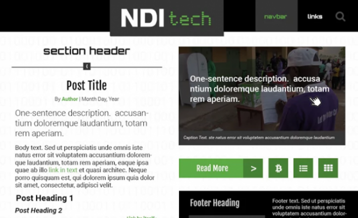
On the NDItech team, one of our goals is to share what we learn and highlight the accomplishments of our partners. Our blog -- NDItech.org -- is our primary platform to accomplish that, but it is also a testing ground for improving the accessibility of online platforms across the Institute.
A lot of things have changed in the four years since we launched NDI’s first blogging experiment -- the team has changed members, common types of programming have shifted and the citizens with whom we work are radically more connected.
For technologists, Marshall McLuhan’s statement "the medium is the message” is particularly apt. Our team cares fundamentally that people around the globe are able to get NDI content on the devices they own. The old site didn’t adapt to different web browsers or screen sizes, and was not accessible to people with disabilities. The design wasn’t adequate for people with visual impairment, and it didn't work with a screen reader -- a device that reads websites out loud to people who cannot see. With the redesigned blog, we've taken our standards to another level, attempting to meet Web Content Accessibility Guidelines (WCAG). Color contrast now meets WCAG requirements, and we have alternative text for images, videos and other multimedia content. We've reduced repetitive links, and ran the site through a number of accessibility testers.
We've also adjusted to changing demands of the Internet as the web has evolved and people are going online in new ways. The site is radically more responsive on handheld web browsers and so will work better for the multitude of inexpensive Android phones now coming on the market for under $50. There's also a renewed focus on images. People like pictures and we like taking them. We hope that scenes from the field illuminate as well as the text.
We also like to experiment on ourselves. Our lead web designer developed both new methods to think about the requirements of a blog and new ways of building websites. We began the redesign process by listing our goals and agreeing on an aesthetic and designing a site structure to match. Through website blueprints and ironing out our style and brand, we set the tone for how the content would be organized and presented. An HTML prototype was then built to showcase the site's design and interactivity. Thanks to that prototype, by the time we were ready to implement the design, we had a head start on testing parts of the code. This strategy reduced time spent in Photoshop, maximized time spent in coding, and gave us a realistic preview of how the site would look and feel, instead of relying on static images of the design.
We hope you like our new site. Let us know what you think on Twitter: @nditech; you can't in comments on the site any more. Comments, we learned, are a thing most folks don't go for.

